Outdated machine design is no longer just a cosmetic issue; it’s a direct threat to your profitability and market share against sleek European competitors.
- Strategic aesthetics can justify premium pricing, as visual appeal is a primary driver in B2B purchase decisions.
- Superior ergonomics and user interface (UX) design directly reduce costly operator errors and unplanned downtime.
Recommendation: Stop treating design as a final touch-up. Instead, embed ‘functional aesthetics’ as a core engineering discipline to build a tangible competitive advantage.
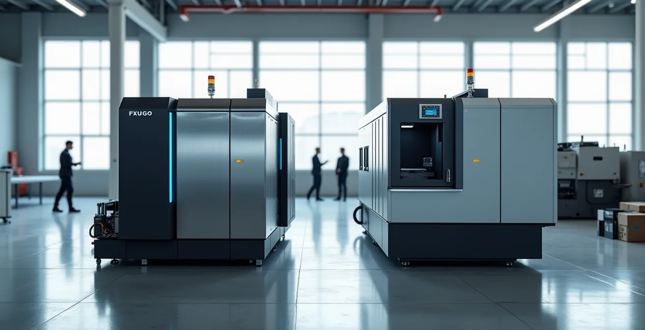
If you’ve ever walked a trade show floor, you’ve felt it. Your machine, a marvel of British engineering, sits next to a German or Italian competitor. Mechanically, they might be equals. But theirs looks sharper, more intuitive, more… valuable. This isn’t a superficial problem; it’s a commercial one. For too long, many OEMs have operated under the engineering-first belief that as long as the machine performs, its appearance is secondary. This mindset has become a significant liability.
The common response is to focus on what we know best: tweaking performance specs, highlighting reliability, or competing on price. We might even consider a new coat of paint. But what if the core issue isn’t the function, but the form? What if the “look and feel” we dismiss as fluff is actually a powerful, silent communicator of quality, usability, and innovation? This is the central premise of functional aesthetics: design is not decoration. It is a strategic discipline with a measurable return on investment.
This article will dismantle the outdated notion that aesthetics are a cost centre. We will explore the hard data linking cohesive visual branding to higher-priced sales. We’ll provide a framework for briefing your engineering teams on aesthetics without sacrificing mechanical integrity. Finally, we’ll delve into the specific design choices—from material finishes to HMI layouts—that reduce operator error and directly impact your client’s bottom line. It’s time to weaponise design and turn your machinery’s appearance from a weakness into your most persuasive sales tool.
Summary: Turning Functional Aesthetics into Your Competitive Edge
- Why buyers pay 20% more for machines with cohesive visual branding?
- How to brief engineers on aesthetics without compromising mechanical integrity?
- Powder coated steel vs stainless: which finish signals ‘premium’ quality?
- The design error that looks good but causes repetitive strain injury (RSI)
- How to declutter control panels to reduce operator reaction time?
- Why confusing dashboard layouts are a primary cause of ‘human error’?
- Why replacing steel with carbon fibre isn’t just about weight, but stiffness?
- Reducing Operator Error by 40%: The Hidden Impact of UX on Industrial HMI
Why Buyers Pay 20% More for Machines with Cohesive Visual Branding?
The idea that a machine’s appearance can command a higher price may feel counterintuitive to a purely engineering mindset, but the evidence is overwhelming. Perception is reality in the marketplace. A machine that looks considered, modern, and cohesive silently communicates reliability and superior performance before a single specification is read. This isn’t just a consumer phenomenon; it’s a powerful force in B2B procurement. In fact, research on visual branding psychology shows that for 93% of consumers, visual appearance is the key deciding factor in a purchase decision, a bias that carries directly into industrial buying.
This principle is what we call Perceived Value Engineering. It’s the deliberate use of form, colour, finish, and visual hierarchy to align the product’s appearance with its price point and brand promise. A cohesive Visual Brand Language (VBL) across a product line does more than just look good; it builds an asset. It creates instant recognition and reinforces the idea of a reliable, professional ecosystem. As research from McKinsey has shown, companies that integrate rigorous design practices outperform their competitors in both revenue growth and total returns to shareholders. They achieve this by ensuring the machine’s aesthetics provide clear visual cues about its function (affordance) and maintain consistency across all interfaces, building user trust and justifying a premium.
When a buyer sees a machine with thoughtful design, they don’t just see a piece of equipment. They see a lower risk investment, easier operator training, and a supplier who pays attention to every detail. That perception of reduced risk and higher quality is precisely what they are willing to pay a premium for. The aesthetic isn’t an added cost; it’s the mechanism that unlocks a higher price point.
How to Brief Engineers on Aesthetics Without Compromising Mechanical Integrity?
The most common point of failure in implementing functional aesthetics is the friction between industrial designers and mechanical engineers. For engineers, any change that doesn’t improve performance, reliability, or cost-efficiency can feel arbitrary. The key to bridging this gap is to reframe the conversation: aesthetics are not about making things “pretty,” but about solving a different set of engineering problems related to usability, serviceability, and perceived value.
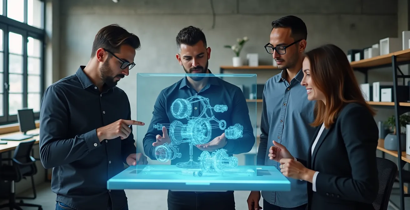
A successful brief treats aesthetics as a set of functional requirements, not artistic suggestions. Instead of saying “make it look sleeker,” define the objective: “We need to reduce the perceived visual complexity to make the machine appear less intimidating to new operators.” This translates a subjective goal into a measurable engineering challenge. The process must be collaborative from the very beginning, using tools like digital twins and VR to allow both teams to interact with the design in a shared context, identifying potential conflicts between form and function early.
This collaborative spirit is captured perfectly by one industry expert’s critique of a common design platitude. As industrial designer David Jaffe notes, the old saying “form follows function” is often used as an excuse for lazy design:
Form follows function is the design world’s version of ‘it’s not you, it’s me.’ In reality, the most successful products are those where form and function evolve together.
– David Jaffe, Industrial Design and Aesthetics on Medium
The goal is to create a shared language. Introduce engineers to concepts like Visual Brand Language (VBL) and ergonomic envelopes as part of the core project constraints, alongside thermal management and structural load paths. When aesthetics are presented as a performance specification—”the enclosure must be serviceable by a single operator without special tools” or “the primary control surface must be usable while wearing safety gloves”—they become concrete problems for engineers to solve, not vague artistic whims to accommodate.
Powder Coated Steel vs Stainless: Which Finish Signals ‘Premium’ Quality?
Material and finish selection is one of the most powerful tools in Perceived Value Engineering. It’s a decision that communicates a machine’s intended use, durability, and quality tier instantly. While engineers rightly focus on corrosion resistance and durability, the aesthetic and psychological impact is just as critical for market positioning. The choice between a textured powder coat and brushed stainless steel, for example, isn’t just technical; it’s a strategic branding decision.
The “premium” signal is highly context-dependent. What reads as high-end in one industry can look out of place in another. As an example, a comprehensive analysis of material perception across sectors reveals these distinct signals:
| Industry | Premium Signal | Key Factors | Cost Impact |
|---|---|---|---|
| Food Processing | Brushed Stainless Steel | Hygiene compliance, FDA standards | +35-45% base cost |
| Construction Equipment | Textured Powder Coat | Durability perception, weather resistance | +15-20% base cost |
| Medical Devices | Electropolished Stainless | Cleanability, precision appearance | +40-50% base cost |
| Agricultural Machinery | Heavy-duty Powder Coat | Ruggedness, maintenance-free appeal | +10-15% base cost |
Beyond the material itself, consistency in colour is a major factor in brand strength. A signature colour, applied with a high-quality finish, creates an immediate and powerful brand association. Studies on visual branding psychology show that a consistent brand colour can increase brand recognition by up to 80%. This is why leading brands don’t just pick a colour; they own it. The specific RAL code for your brand’s powder coat should be as sacrosanct as your logo.
Ultimately, the right choice depends on the story you want to tell. A heavy-duty textured powder coat signals ruggedness and reliability, perfect for construction or agricultural machinery. A brushed or electropolished stainless steel finish, on the other hand, signals precision, hygiene, and high-technology, making it ideal for medical or food processing equipment. The key is to make this decision deliberately, aligning the material’s functional properties with its powerful psychological message.
The Design Error That Looks Good but Causes Repetitive Strain Injury (RSI)
In the pursuit of a minimalist, “sleek” aesthetic popularised by consumer electronics, a dangerous trend has emerged in industrial design: the flush, buttonless interface. While a smooth, unbroken surface of glass or plastic can look incredibly modern on a brochure, it can be an ergonomic nightmare in an industrial environment. This is a classic case of form actively working against function, leading to a significant risk of Repetitive Strain Injury (RSI) for operators.
The problem lies in a lack of tactile feedback. Human hands are designed to interact with physical objects. When an operator presses a physical button, they receive multiple feedback cues: the feeling of the button moving, the click sound, and the change in resistance. These cues confirm the action has been registered. A flush capacitive touch surface provides none of this. The operator must rely solely on a visual change on the screen, forcing them to apply more pressure than necessary and tense their hand and wrist to ensure contact. Repeating this motion thousands of times a day is a direct cause of RSI.

Good ergonomic design isn’t about rejecting modern aesthetics; it’s about applying them intelligently. The solution is to create a balanced tactile hierarchy. High-frequency or critical controls—like ‘Start,’ ‘Stop,’ or ‘Jog’—should always be physical buttons with distinct shapes, sizes, and textures. This allows for “no-look” operation, where an experienced user can find the right control by feel alone, dramatically improving efficiency and reducing physical and cognitive strain. Less-used functions, like setup parameters or diagnostics, can be relegated to a touchscreen interface.
The obsession with flush surfaces is a design trap. It prioritises a fleeting aesthetic trend over the long-term health of the operator and the overall usability of the machine. True premium design is not just about how a machine looks, but how it feels to use for eight hours a day, five days a week.
How to Declutter Control Panels to Reduce Operator Reaction Time?
A cluttered, confusing control panel is more than just an eyesore; it’s a direct tax on your client’s productivity. Every moment an operator spends searching for the right button or deciphering a cryptic icon is a moment the machine isn’t running. In a high-pressure environment, this cognitive friction not only slows down reaction times but dramatically increases the likelihood of human error. The goal of HMI design is to reduce cognitive load—the amount of mental effort required to perform a task. Industry data shows that optimising cluttered HMIs can lead to a 20% reduction in unplanned downtime, a massive ROI for what is often seen as a “soft” design issue.
Decluttering isn’t about removing features; it’s about organising them intelligently. The most effective principle is progressive disclosure. This means that by default, the interface only shows the most critical, high-frequency controls. Secondary or advanced functions are hidden within clearly labelled sub-menus. This approach respects the operator’s attention, presenting them only with what they need for the task at hand. It transforms a daunting wall of 100 buttons into a manageable set of 5-7 primary actions, drastically reducing learning time and decision paralysis.
To implement this effectively, a structured design process is essential. It requires moving beyond guesswork and applying proven UX principles to the industrial space. This checklist provides a starting point for auditing and redesigning your HMI for clarity and speed.
Action Plan: 5 Steps to a High-Performance HMI
- Assess Cognitive Load: Use established models like the NASA-TLX to objectively measure the mental workload of key operator tasks and identify high-friction points in your current interface.
- Apply Progressive Disclosure: Hide advanced or setup functions behind clearly-labelled sub-menus. The primary screen should only contain controls essential for daily operation.
- Create Functional Zones: Group controls into logical areas (‘Setup’, ‘Operation’, ‘Diagnostics’) and use subtle colour coding or background separation to create a strong visual hierarchy.
- Size Controls by Importance: Apply Fitts’s Law. Critical and frequently used controls like an Emergency Stop must be significantly larger and placed in an easily accessible location.
- Provide Immediate Feedback: Every operator action must trigger an immediate and unambiguous visual or auditory response (e.g., a button changing colour, a status indicator updating) to confirm the system has received the command.
By treating the HMI as a critical performance component, not an afterthought, you provide your clients with a machine that is not only powerful but also efficient and safe to operate. This is a tangible competitive advantage that speaks directly to their operational efficiency.
Why Confusing Dashboard Layouts Are a Primary Cause of ‘Human Error’?
The term “human error” is often a lazy diagnosis for a systemic failure. More often than not, it’s a “design error” that sets the operator up to fail. When a dashboard presents a flood of undifferentiated data, alarms, and status indicators, it overwhelms the operator’s cognitive capacity. This leads to a dangerous phenomenon known as cognitive tunneling, where the operator fixates on one prominent (but potentially non-critical) piece of information while missing crucial warnings in their periphery. In this state, a preventable issue can quickly escalate into a major incident.
The most infamous example of this is the Three Mile Island nuclear incident in 1979. While equipment malfunction was a trigger, the investigation revealed that the control room’s HMI was a major contributing factor. Operators were bombarded with hundreds of blinking lights and alarms, making it impossible to distinguish the critical signal from the background noise. They were unable to correctly diagnose the core problem—a stuck-open relief valve—because key indicators were either hidden, ambiguous, or contradictory. The design of the interface actively prevented a competent crew from understanding the state of the system, leading to a partial meltdown.
While most industrial machines don’t pose a nuclear risk, the principle is the same. A confusing HMI forces operators to build an inaccurate mental model of the machine’s status. When an unexpected event occurs, their actions will be based on this flawed model, leading to incorrect decisions. This is why effective HMI design focuses on situational awareness. The layout should tell a story, with a clear visual hierarchy that guides the operator’s attention to what matters most. Critical alerts must be visually and audibly distinct from routine status messages. Data should be presented graphically (e.g., trend lines, gauges) rather than as raw numbers, allowing for at-a-glance comprehension.
Blaming the operator is an abdication of design responsibility. A well-designed HMI anticipates potential failure modes and provides clear, unambiguous information, empowering the operator to become the first line of defence, not the final point of failure.
Why Replacing Steel with Carbon Fibre Isn’t Just About Weight, but Stiffness?
The conversation around advanced materials like carbon fibre composites in industrial machinery often gets stuck on a single metric: weight reduction. While this is a significant benefit, especially for moving parts, it overlooks the material’s most strategic advantages for high-performance applications: stiffness and damping. For an OEM looking to establish a position as a technology leader, understanding and marketing these properties is crucial.
First, the superior stiffness-to-weight ratio of carbon fibre is a game-changer for precision. In applications like high-speed robotics or CNC machining, the primary enemy of accuracy is tool head deflection under load. A stiffer robotic arm or gantry deflects less, allowing it to move faster and maintain tighter tolerances. This translates directly into higher throughput and better part quality for your client—a far more compelling benefit than simply being “lighter”.
Second, composites can be engineered with specific vibration damping properties. Unlike metals which tend to transmit vibrations, carbon fibre can be laid up in a way that absorbs them. As detailed in technical analyses of its structural dynamics, this reduces wear and tear on critical components like bearings and motors, extending the machine’s service life and reducing maintenance costs. This shifts the value proposition from a simple performance boost to a lower total cost of ownership.
Finally, and just as importantly, is the marketing narrative power. Adopting carbon fibre allows an OEM to borrow the technological prestige of the aerospace and Formula 1 industries. It’s a powerful visual signal that your company is at the cutting edge. This narrative transforms the material from a line item on a bill of materials into a key feature of your brand identity, justifying a premium price and attracting clients who want the very best. Thus, a decision to use carbon fibre is as much a marketing strategy as it is an engineering one, as confirmed by research into the benefits of carbon fiber composites beyond simple weight savings.
Key Takeaways
- Functional aesthetics are a profit multiplier, not a cost centre, directly influencing a buyer’s willingness to pay a premium.
- Effective HMI/UX design is a critical safety feature that reduces cognitive load and can cut operator errors and unplanned downtime significantly.
- Material and finish choices are strategic branding decisions that communicate quality and intended use, shaping perceived value before a machine is even turned on.
Reducing Operator Error by 40%: The Hidden Impact of UX on Industrial HMI
We’ve established that poor design can lead to catastrophic failure, but the inverse is equally powerful: excellent design delivers a dramatic and measurable return on investment. The modern approach to this is to treat the Human-Machine Interface not just as a panel of buttons, but as a complete User Experience (UX). This means holistically considering every interaction an operator has with the machine, from initial setup to routine operation and emergency response. The impact of a well-executed UX strategy can be seen directly in metrics like safety, efficiency, and uptime.
User frustration is a tangible metric. When an interface is confusing or unresponsive, operators exhibit clear signs of it. In the digital world, recent UX research reveals that nearly 40% of all digital sessions contain frustration signals like “rage clicks” due to poor design. This same frustration exists on the factory floor, but the consequences are far greater than a lost web sale—it leads to errors, damage, and downtime. A strategic UX overhaul aims to eliminate these friction points. For example, a modern, successful HMI redesign at a mid-size oil refinery in 2024 yielded a 25% drop in safety-related incidents and a 30% boost in operator efficiency. This was achieved by implementing context-aware alarm grouping and hierarchical displays that guided, rather than overwhelmed, the operators.
Achieving these results requires a shift in mindset. It means investing in UX experts who can conduct ethnographic studies—observing operators in their actual work environment—to identify real-world pain points. It means prototyping and testing interfaces with actual users before committing to code. It means creating a design system with consistent icons, terminology, and layouts across all your machines to reduce the learning curve for staff who operate multiple pieces of equipment.
Ultimately, a superior HMI/UX becomes a durable competitive advantage. While a competitor might copy a mechanical feature, it’s far more difficult for them to replicate the deep, thoughtful design of an intuitive and efficient user experience. It becomes a core part of your brand promise: a machine from your company is not just powerful and reliable, but also safe, easy, and even pleasant to use.
To compete and win against today’s market leaders, you must move beyond a purely mechanical definition of excellence. The next step is to begin a critical audit of your own products’ functional aesthetics and user experience. Start treating your industrial design as the high-leverage strategic asset it is.